

Jonathan Schwabish is an economist and writer, teacher, and creator of policy-relevant data visualizations.
Meer over Jonathan SchwabishData Visualization in Excel
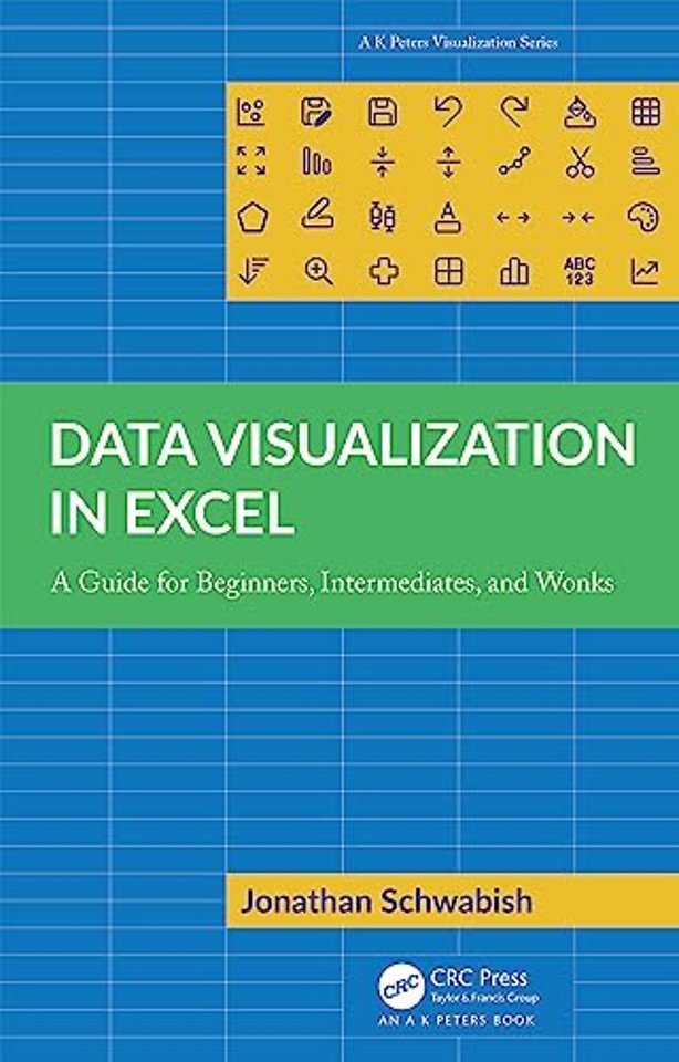
A Guide for Beginners, Intermediates, and Wonks
Gebonden Engels 2023 1e druk 9781032343280Samenvatting
This book closes the gap between what people think Excel can do and what they can achieve in the tool. Over the past few years, recognition of the importance of effectively visualizing data has led to an explosion of data analysis and visualization software tools. But for many people, Microsoft Excel continues to be the workhorse for their data visualization needs, not to mention the only tool that many data workers have access to.
Although Excel is not a specialist data visualization platform, it does have strong capabilities. The default chart types do not need to be the limit of the tool’s data visualization capabilities, and users can extend its features by understanding some key elements and strategies. Data Visualization in Excel provides a step-by-step guide to creating more advanced and often more effective data visualizations in Excel and is the perfect guide for anyone who wants to create better, more effective, and more engaging data visualizations.
Specificaties
Lezersrecensies
Inhoudsopgave
PART ONE: SETTING THE STAGE.
1. Introduction.
2. How to Use This Book.
3. The Philosophy of Data Visualization in Excel.
4. Introduction to Making Graphs in Excel.
5. Fundamental Formulas Used in Building Your Graphs.
6. Building a Custom Color Palette in Excel.
PART TWO: MAKING GRAPHS IN EXCEL.
7. Sparklines.
8. Heatmap.
9. Stripe Chart.
10. Waffle Chart.
11. Gantt Chart.
12. Comparing Values with Two Graph Types.
13. Broken Stacked Bar Chart.
14. Diverging Bar Chart.
15. Block Shading (Same Frequency).
16. Block Shading (Different Frequencies).
17. Mark an Event with a Line.
18. Dot Plot.
19. Slope Chart.
20. Overlaid Gridlines.
21. Lollipop Chart.
22. Bullet Chart.
23. Tile Grid Map.
24. Histogram.
25. Marimekko Chart.
26. Cycle Plot.
27. Strip Chart.
28. Raincloud Plot.
29. Making Better Tables.
PART THREE: MOVING VISUALS OUT OF EXCEL.
30. Exporting Graphs from Excel.
31. Redesigns and Examples.
32. Conclusion.
Appendix 1. Color Tools.
Appendix 2. Data Visualization Tools.
Appendix 3. Additional Excel Resources.
Appendix 4. Quick Instructions List.
References.
Index.
Anderen die dit boek kochten, kochten ook
Rubrieken
- advisering
- algemeen management
- coaching en trainen
- communicatie en media
- economie
- financieel management
- inkoop en logistiek
- internet en social media
- it-management / ict
- juridisch
- leiderschap
- marketing
- mens en maatschappij
- non-profit
- ondernemen
- organisatiekunde
- personal finance
- personeelsmanagement
- persoonlijke effectiviteit
- projectmanagement
- psychologie
- reclame en verkoop
- strategisch management
- verandermanagement
- werk en loopbaan


