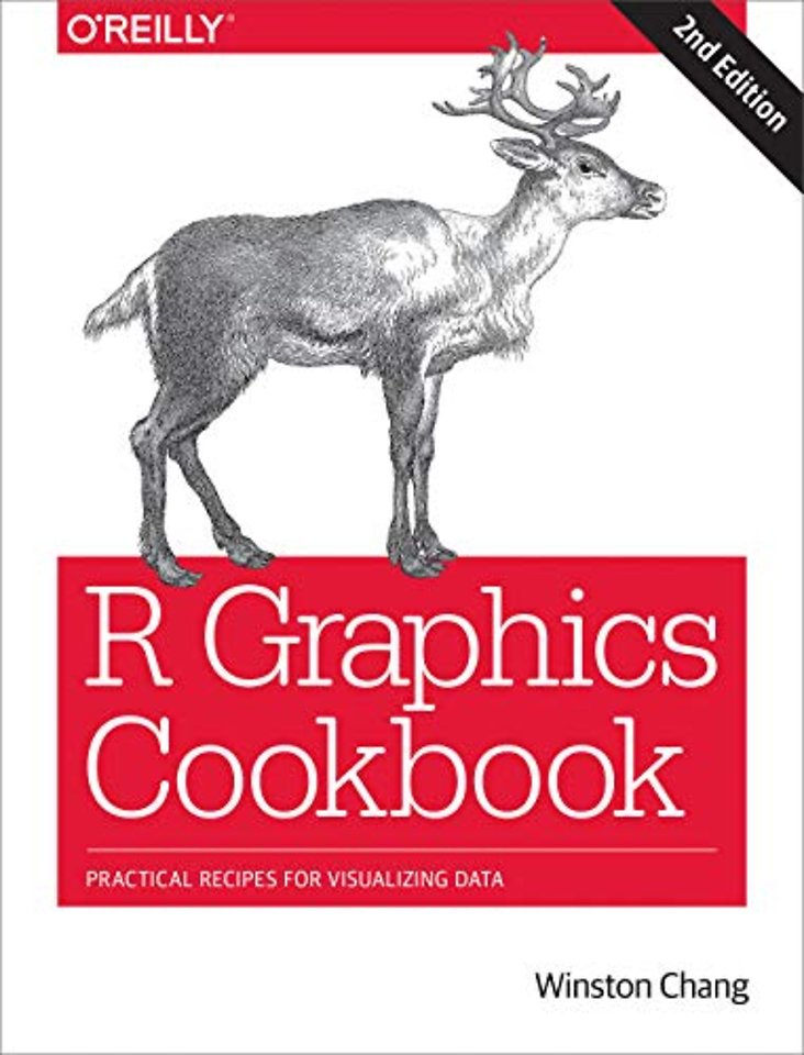
R Graphics Cookbook
Practical Recipes for Visualizing Data
Paperback Engels 2018 2e druk 9781491978603Samenvatting
This O’Reilly cookbook provides more than 150 recipes to help scientists, engineers, programmers, and data analysts generate high-quality graphs quickly—without having to comb through all the details of R’s graphing systems. Each recipe tackles a specific problem with a solution you can apply to your own project and includes a discussion of how and why the recipe works.
Most of the recipes in this second edition use the updated version of the ggplot2 package, a powerful and flexible way to make graphs in R. You’ll also find expanded content about the visual design of graphics. If you have at least a basic understanding of the R language, you’re ready to get started with this easy-to-use reference.
- Use R’s default graphics for quick exploration of data
- Create a variety of bar graphs, line graphs, and scatter plots
- Summarize data distributions with histograms, density curves, box plots, and more
- Provide annotations to help viewers interpret data
- Control the overall appearance of graphics
- Explore options for using colors in plots
- Create network graphs, heat maps, and 3D scatter plots
- Get your data into shape using packages from the tidyverse
Specificaties
Lezersrecensies
Inhoudsopgave
Recipes
Software and Platform Notes
Conventions Used in This Book
O’Reilly Safari
How to Contact Us
Acknowledgments
1. R Basics
1.1. Installing a Package
1.2. Loading a Package
1.3. Upgrading Packages
1.4. Loading a Delimited Text Data File
1.5. Loading Data from an Excel File
1.6. Loading Data from SPSS/SAS/Stata Files
1.7. Chaining Functions Together with %>%, the Pipe Operator
2. Quickly Exploring Data
2.1. Creating a Scatter Plot
2.2. Creating a Line Graph
2.3. Creating a Bar Graph
2.4. Creating a Histogram
2.5. Creating a Box Plot
2.6. Plotting a Function Curve
3. Bar Graphs
3.1. Making a Basic Bar Graph
3.2. Grouping Bars Together
3.3. Making a Bar Graph of Counts
3.4. Using Colors in a Bar Graph
3.5. Coloring Negative and Positive Bars Differently
3.6. Adjusting Bar Width and Spacing
3.7. Making a Stacked Bar Graph
3.8. Making a Proportional Stacked Bar Graph
3.9. Adding Labels to a Bar Graph
3.10. Making a Cleveland Dot Plot
4. Line Graphs
4.1. Making a Basic Line Graph
4.2. Adding Points to a Line Graph
4.3. Making a Line Graph with Multiple Lines
4.4. Changing the Appearance of Lines
4.5. Changing the Appearance of Points
4.6. Making a Graph with a Shaded Area
4.7. Making a Stacked Area Graph
4.8. Making a Proportional Stacked Area Graph
4.9. Adding a Confidence Region
5. Scatter Plots
5.1. Making a Basic Scatter Plot
5.2. Grouping Points Together Using Shapes or Colors
5.3. Using Different Point Shapes
5.4. Mapping a Continuous Variable to Color or Size
5.5. Dealing with Overplotting
5.6. Adding Fitted Regression Model Lines
5.7. Adding Fitted Lines from an Existing Model
5.8. Adding Fitted Lines from Multiple Existing Models
5.9. Adding Annotations with Model Coefficients
5.10. Adding Marginal Rugs to a Scatter Plot
5.11. Labeling Points in a Scatter Plot
5.12. Creating a Balloon Plot
5.13. Making a Scatter Plot Matrix
6. Summarized Data Distributions
6.1. Making a Basic Histogram
6.2. Making Multiple Histograms from Grouped Data
6.3. Making a Density Curve
6.4. Making Multiple Density Curves from Grouped Data
6.5. Making a Frequency Polygon
6.6. Making a Basic Box Plot
6.7. Adding Notches to a Box Plot
6.8. Adding Means to a Box Plot
6.9. Making a Violin Plot
6.10. Making a Dot Plot
6.11. Making Multiple Dot Plots for Grouped Data
6.12. Making a Density Plot of Two-Dimensional Data
7. Annotations
7.1. Adding Text Annotations
7.2. Using Mathematical Expressions in Annotations
7.3. Adding Lines
7.4. Adding Line Segments and Arrows
7.5. Adding a Shaded Rectangle
7.6. Highlighting an Item
7.7. Adding Error Bars
7.8. Adding Annotations to Individual Facets
8. Axes
8.1. Swapping X- and Y-Axes
8.2. Setting the Range of a Continuous Axis
8.3. Reversing a Continuous Axis
8.4. Changing the Order of Items on a Categorical Axis
8.5. Setting the Scaling Ratio of the X- and Y-Axes
8.6. Setting the Positions of Tick Marks
8.7. Removing Tick Marks and Labels
8.8. Changing the Text of Tick Labels
8.9. Changing the Appearance of Tick Labels
8.10. Changing the Text of Axis Labels
8.11. Removing Axis Labels
8.12. Changing the Appearance of Axis Labels
8.13. Showing Lines Along the Axes
8.14. Using a Logarithmic Axis
8.15. Adding Ticks for a Logarithmic Axis
8.16. Making a Circular Plot
8.17. Using Dates on an Axis
8.18. Using Relative Times on an Axis
9. Controlling the Overall Appearance of Graphs
9.1. Setting the Title of a Graph
9.2. Changing the Appearance of Text
9.3. Using Themes
9.4. Changing the Appearance of Theme Elements
9.5. Creating Your Own Themes
9.6. Hiding Grid Lines
10. Legends
10.1. Removing the Legend
10.2. Changing the Position of a Legend
10.3. Changing the Order of Items in a Legend
10.4. Reversing the Order of Items in a Legend
10.5. Changing a Legend Title
10.6. Changing the Appearance of a Legend Title
10.7. Removing a Legend Title
10.8. Changing the Labels in a Legend
10.9. Changing the Appearance of Legend Labels
10.10. Using Labels with Multiple Lines of Text
11. Facets
11.1. Splitting Data into Subplots with Facets
11.2. Using Facets with Different Axes
11.3. Changing the Text of Facet Labels
11.4. Changing the Appearance of Facet Labels and Headers
12. Using Colors in Plots
12.1. Setting the Colors of Objects
12.2. Representing Variables with Colors
12.3. Using a Colorblind-Friendly Palette
12.4. Using a Different Palette for a Discrete Variable
12.5. Using a Manually Defined Palette for a Discrete Variable
12.6. Using a Manually Defined Palette for a Continuous Variable
12.7. Coloring a Shaded Region Based on Value
13. Miscellaneous Graphs
13.1. Making a Correlation Matrix
13.2. Plotting a Function
13.3. Shading a Subregion Under a Function Curve
13.4. Creating a Network Graph
13.5. Using Text Labels in a Network Graph
13.6. Creating a Heat Map
13.7. Creating a Three-Dimensional Scatter Plot
13.8. Adding a Prediction Surface to a Three-Dimensional Plot
13.9. Saving a Three-Dimensional Plot
13.10. Animating a Three-Dimensional Plot
13.11. Creating a Dendrogram
13.12. Creating a Vector Field
13.13. Creating a QQ Plot
13.14. Creating a Graph of an Empirical Cumulative Distribution Function
13.15. Creating a Mosaic Plot
13.16. Creating a Pie Chart
13.17. Creating a Map
13.18. Creating a Choropleth Map
13.19. Making a Map with a Clean Background
13.20. Creating a Map from a Shapefile
14. Output for Presentation
14.1. Outputting to PDF Vector Files
14.2. Outputting to SVG Vector Files
14.3. Outputting to WMF Vector Files
14.4. Editing a Vector Output File
14.5. Outputting to Bitmap (PNG/TIFF) Files
14.6. Using Fonts in PDF Files
14.7. Using Fonts in Windows Bitmap or Screen Output
14.8. Combining Several Plots into the Same Graphic
15. Getting Your Data into Shape
15.1. Creating a Data Frame
15.2. Getting Information About a Data Structure
15.3. Adding a Column to a Data Frame
15.4. Deleting a Column from a Data Frame
15.5. Renaming Columns in a Data Frame
15.6. Reordering Columns in a Data Frame
15.7. Getting a Subset of a Data Frame
15.8. Changing the Order of Factor Levels
15.9. Changing the Order of Factor Levels Based on Data Values
15.10. Changing the Names of Factor Levels
15.11. Removing Unused Levels from a Factor
15.12. Changing the Names of Items in a Character Vector
15.13. Recoding a Categorical Variable to Another Categorical Variable
15.14. Recoding a Continuous Variable to a Categorical Variable
15.15. Calculating New Columns from Existing Columns
15.16. Calculating New Columns by Groups
15.17. Summarizing Data by Groups
15.18. Summarizing Data with Standard Errors and Confidence Intervals
15.19. Converting Data from Wide to Long
15.20. Converting Data from Long to Wide
15.21. Converting a Time Series Object to Times and Values
Understanding ggplot2
Background
Some Terminology and Theory
Building a Simple Plot
Printing
Stats
Themes
End
Index
Anderen die dit boek kochten, kochten ook
Rubrieken
- advisering
- algemeen management
- coaching en trainen
- communicatie en media
- economie
- financieel management
- inkoop en logistiek
- internet en social media
- it-management / ict
- juridisch
- leiderschap
- marketing
- mens en maatschappij
- non-profit
- ondernemen
- organisatiekunde
- personal finance
- personeelsmanagement
- persoonlijke effectiviteit
- projectmanagement
- psychologie
- reclame en verkoop
- strategisch management
- verandermanagement
- werk en loopbaan


